Friday 15 May 2015

Off the Map: Post Mortem

   Well, We've reached the end of the Off the Map project in terms of the DMU deadline. From now, all work towards this project will be for the official competition deadline which is on the 22nd of June. This project has been a challenging one, which all of my group have learnt so much from in varying ways.
   Off the Map is a competition set by Game City and the British Library. This year's competition was based on Alice's Adventures Underground, which meant you could make the focus of your level Oxford, Underground, Gardens or a mixture of the three. We initially were considering a mix of perhaps two, however when it came to it, we decided to make an extended level based on the theme of Oxford. In my group were Carla Chanquia, Lewis Gibbons, Jonah Holden-Maillard, Carl James, Andrew Simpson and myself. 
   This has been our longest running project so far, having started in February. Originally the deadline was the 24th of April, however we were given a two week extension to the 8th of May. I can't really believe how long it's been, but in honesty, I'm glad the pressure is off for this project. I'd be lying if I said I've enjoyed this project in it's entirety. It's... been a long few months to say the least. At some points it felt like we were at a standstill and that the project would never come to an end. It has been a relief to reach the end of this, so that our minds can have something different to focus on. 
   To tell you the truth, I think this project has made my group miserable and despondent at many points. We started with such enthusiasm for where the project may lead, which only evaporated as time progressed. I believe this to be due to multiple reasons, one being that we started with too big an area, which was probably a bit monotonous at times. I believe if we had started with something smaller then progressed once we had something we were happier with then we would have felt like we were making more consistent progress.    
   My role in this project was both as a Concept Artist and an Environment Modeller. Both Lewis and I wanted to do concept art, so we were happy to split the roll between us. I think, however, perhaps both of us but most certainly myself, should have spent longer on the concepting stage. A lot of my concepting went into the shops that are around the level and I feel I should have spent more time on the street level and made it more interesting. These are a few of the concepts I produced for the shops in the level. Two of which, the Apothecary and Florist, can be entered. 


   Our level doesn't have a lot in it which screams Alice in Wonderland, which I think we should have worked harder to fix in the concepting stage. Personally I'd have rather had the level more fantasy based, maybe it could become more twisted and strange as you progress through it. I didn't try to push these ideas too much, as the group consensus seemed to be that we wanted to keep it realistic and I thought hey, in the end the majority rules and in the industry I would have to be flexible. I wish I had ignored this and spoken my mind, I really do, because my enthusiasm for what we were doing eventually ran dry and I began to resent the project as I realised I'd have adored to do something fantasy based and stylised instead.
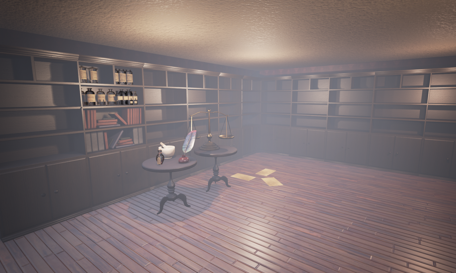
   It sort of became my job to focus on the shops after that. I built generic buildings which could snap together and which I'd be able to plug the shop fronts into, as well as building the Apothecary and the Florist interiors. After this my job was mainly to create assets. I created a multitude of street assets alongside assets for the interiors of the Florist and Apothecary. 
   These are the assets that I made for the insides of the shops, along with building and texturing the interiors. I think the shop interiors have been the most enjoyable part of the project for me. I designed their layout and appearance, so I kind of felt like I had more licence with these. I think they went pretty well but I'd have liked to devote more time to the concept stage and have spent more time polishing and refining these areas. 
   These are a few screenshots of the final level. Overall, I do think it's good and I am proud of it... but I think it could be much better and I could be much prouder. I feel sad that it didn't go entirely to plan, however this project has been a steep learning curve and I'm not going to let the mistakes we made stop me from enjoying the achievement I do feel by helping bring this level to a close. I do endeavour to learn from my mistakes and just use this experience to make me a better artist and improve my work ethic.


What worked well?
   I think as a team we were considerate of one another and eager to help each other when we were needed. We all got along well and all of us are good team members, I think we just didn't execute the idea to the best of our ability, which is disappointing. I also think we did a good job of getting the level more populated towards the end. The level looked monotonous, so we were advised to clutter it a bit more with more objects and it's really made a difference. It could still use a lot more, but what we've added so far really helps it come to life that little bit extra. One of my favourite things about the level is the rabbit that Carla made. It acts as a character for the player to follow to the end of the level and it's just so beautifully animated. I also think Jonah's work on the pick up mechanics is really good as well. He made it so that when you collected the ink and page pick ups it showed you how many you had left to collect, which I feel is an addition that makes it feel like an actual game and feel like there's a purpose for playing it.

What went wrong?
   Well, as I've mentioned before, personally I wish we had chosen a different subject, made it more fantasy based and added some stylisation. The problem is, by the time that this really bothered me, it was too late to say anything. I should have said something in the beginning. The issue there is that I'm not even remotely an outspoken person. However, I'm working on my confidence, which admittedly did grow as I worked with my group more.
   I think our biggest problem was the scale. We made something too large too quickly when really we should have been trying to make something smaller then adding to it as we had more time. It wasn't only just that it was big though, I think a big problem is that it's all streets. I think we needed more features to break it up, perhaps a small courtyard or something. 
   I think we should have been assigned specific things. I think part of the reason I didn't do as much concept work was because I felt pressure early on to start making things that we needed for the level. Maybe this would have been remedied if we'd just had one person working on visualisation, and that was their main job.

What would I do differently?
   If I were to do this project again, I'd ensure I was doing something that inspired me from the beginning. I think we were thinking too much about what Game City and the British Library would want from us rather than focusing on making something interesting and beautiful. I've learnt from this that the absolute worst thing is to be stuck in a long project doing something that doesn't interest you. So next time, I will speak my mind, make my opinions known and really push for what I think will inspire me.
   I will also spend longer on the concepting stage. I'm annoyed at myself for not doing so anyway, because I feel the visualisation part of a project is the most pertinent part. If that fails, then the rest surely will too. Like I said earlier, I think it would be better if the job was down to one person and it was the majority of their focus. So in that sense I think next time I'd make sure that everyone had concrete roles.

   To be honest at this point I'm just glad it's over. My group are taking some time off of it, working on some other projects to make us feel fresh again and remember why we love game art. We'll be having a group meeting to discuss if we want to take this project further, but until then, I'm going to be working on a level with Lucy Burbidge and Amanda Bruce based on Hansel and Gretel, which I'll put regular updates of on here.
   I feel like I've learnt a lot from the mistakes made in this project and that can only make me a stronger artist in the future. So, here's to the future!


-Georgia


Thursday 23 April 2015

Week 30 - So..Very.. Close..

   After finishing the character project at the very beginning of the week, the rest of my time I spent panicking over the essay and Off the Map. 


   I had to let the essay take priority as the deadline is tomorrow. I've submitted it now and my panicky feelings are easing a bit now that I only have one major deadline to work towards, instead of the three I had at the beginning of the week. It's done.
    I actually found that I really enjoyed the essay, once I had a sort of plan set out of what I was writing. This essay forced me to research and in a way kind of rediscover what it is I love about Game Art. Questioning myself with 'What do I want to do?' really threw me because I had no idea. So writing this essay has kind of led me on a road of self discovery and now that it's over, it's been a really worthwhile and actually enjoyable assignment.
   I also had a chance to really analyse my art books, which is something I love to do anyway, but now I had an excuse! 

   As well as this, on Tuesday we had a presentation for Off The Map. The general consensus and feedback of this was that it looked a bit plain and like a model city and needed more points of interest. Personally, I think that we attempted too large of an area, and we've all become despondent as the project progressed. We were advised to grunge it up, add interesting features like vines, weeds, puddles etc. We were also advised to make some lower poly buildings to put in the skyline, so that it appears to the player like you are in a large city.  So my aim for the remainder of this week is to get the textures I needed to do finished and produce some more paint overs focusing on improvements we could make to the level based on the feedback we had. We're also going to add more street furniture to clutter up the street. At the moment it looks like a bit of a ghost town, so we need to add more assets to make it more enjoyable to play through. We have also been thinking about changing the time of day as well, and give more dramatic lighting effects to make it more interesting.

   Although I have mostly been focusing on the essay for the past few days, I did manage to get all of the apothecary textures and all of my set assets for the interior of the apothecary finished and started to place them in engine. The apothecary is my favourite part that I've done so far, and I'm really looking forward to seeing the other assets that are being made inside it.


   I kind of can't wait until the deadline passes for this, because I'm going to be working on a personal project with Lucy Burbidge and Amanda Bruce. We're going to build a stylized, low poly level based off of the fairy tale, Hansel and Gretel. I'm so excited for this and have done a few quick concepts, but it'll be good to get properly into it once we've finished with Off the Map. In the mean time though, I'm going to be giving my full attention to Off the Map for the next two weeks! 

Wednesday 22 April 2015

Dichotomy Post-Mortem

   After having  week away from this project, I thought it would be a good idea to go back and reflect on how I think it went, what went well and what I'd improve etc. I think this was an excellent project to be honest, stressful; but enjoyable.

   As always, my favourite part of the project was the beginning. I love the research and idea development part of a project and this one was no exception. The aim of this project was to create two characters that were complete opposites, but would exist in the same universe. I started by mapping some brief ideas and looking at general character relationships and thinking about which ones inspired me enough to take further. With a few ideas in mind, I went onto Pinterest and compiled my findings into a large mood board to help me out.


My favourite of all the ideas I was thinking of was a brother / sister duo. Various sections of my research inspired a story for my characters and I came up with the idea that the characters were a brother and sister who had gone hiking with their parents and gotten lost from them. I really wanted to make them obviously different from one another, but establish a clear and strong bond between them. They were to be extremely different in appearance and personality. He was to be tall, gangly and made of sharp angles, whilst she was to be small and made of rounder shapes. He was also to adopt the character of the moody teen, whilst she is cute, sweet and ever so slightly irritating.
   I made a bash kit, which was helpful because it helped me visualise more the kind of shapes that would be used to make up the duo. I used these to make some sketches of my characters  to see how they fit together, always trying to make sure their designs complimented one another.


   I was pretty secure with my idea, so I looked further into the designs, trying to make them both contrast as much as possible. I focused on making everything about the girl's appearance small and rounded, whereas I wanted the boy to contrast by giving every part of him very angular edges. I then experimented with the boy's face and hair style. I decided I quite liked how he looked with long hair with one shaved side, so that he'd have more of an alternative look.


    I thought it important that I make sure both characters have a strong silhouette, so I worked on this next. I did some value paints next to them to find a design I liked, all the while experimenting with hair and costume.


   After this I experimented with some different values, so I could see which designs contrasted well with one another. I'd had a presentation and I'd been advised to make the girl's  hair contrast more with her shawl, and make her neck longer so that her silhouette is better.


   I then focused on adding more detail to my characters texture-wise. Even now after re submission though, I think I could have made the textures more interesting. It makes me a bit sad to look back at these concepts because even now I'm still really proud of them, I'm just dissapointed that I was unable to translate the idea into 3D effectively.


   After focusing on the colours, I drew both characters in a T pose so I'd be able to model from them.


   This was the little girl by the end. She's not AWFUL, but she could do with re-working. I only resubmitted the boy, because he has the more immediate problems. I'd like to come back to this model and perfect this on too, because frankly, it's a creepy model. If you look at her face on the side pose, she looks like a creepy doll. So if I come back to this, like I have been saying I would since we initially finished this project, my first port of call would be to sort out her face and round her features to it more. I would also improve the models topology and make her had more similar to the concepts.


   Modelling the boy has been a steep learning curve, but I have learnt a hell of a lot from doing this project. This is what the model looked like initially. I know. It makes me cringe looking at it. I can't believe I ever looked at it and thought 'Yeah this is going well.' He was way too feminine in appearance for words, and had the same unsettling doll appearance as his sister.


   I tried to refine this further to a point that I was happier with. At the time I thought it was a massive improvement, and I suppose it still is. I just can't look at the topology without cringing, although the face was much better. In my formative assessment meeting we discussed how it was still feminine in appearance, so I took it away and concepted some more.


   My main points of crit were to improve his topology, give him more defined textures, and give him a more broad chin to make him look more male. I did some concepts to start off with, because I wanted to know what I was aiming for. I decided that I wanted to change him, so I looked at disney 3d models like Tadashi from Big Hero 6. I was making him slightly older, but it was okay because having an aged point of reference helped me draw out his whole stance and stature to a more concrete reference.

   I decided that until I have mastered faces properly and can translate it to a model well, I would change the hairstyle to a short, more masculine style, rather than the alternative style hair. 


    After deciding to keep the same colours and essentially the same outfit, I thought that I might give him a hat instead of just hair, to make his head more interesting.


   This was the finished result by the time I had finished modelling, re unwrapping and texturing.I think pretty much every aspect of the character is a massive improvement and now he definitely looks male. He's less stylized but is modeled more effectively. I'm going to work harder on stylisation, because it's really enjoyable and I think I could be really good at it if I pushed myself. I've given him better hands and his shoes are leaps and bounds better than what they were.


   I think this project has taught me a lot over the course the original project and the re submission, and I think it's so comforting to see how far I've come. I enjoyed this project so much and I potentially might think of just redoing it completely for fun, as a personal project. I'm immensely proud of this achievement.


Monday 20 April 2015

Week 29 - Character Progress and Presentations!

   I feel like I'm making steady progress as I am one by one checking things off my list. I've finished the character project for re submission to a quality that I am very happy with. I didn't think it would take as long as it did originally, as I had only intended to change the topology and improve the textures. I ended up rebuilding a lot of sections though, so I needed to unwrap them and re texture. I've been enjoying it actually, because I feel like I've made remarkable improvements to the character. I think he still comes across as a moody teenager, but now he actually looks genuinely male. Over the summer I may re-design and model my other character, so they can be a more solid portfolio piece together. 

   This is what the character looked like when it was originally submitted. The one underneath is the character after my feedback session. I have made the face and overall physique broader, re modeled areas (the ears, for instance), re designed the character in terms of hair and facial features and improved the textures. 


   Here are some beauty renders of the finished character. It's a massive improvement over the previous character, and I'm really proud of how much I've improved since just before Christmas. Honestly, it's made me really happy and has made me want to practice and improve even more. It's also made me realise that even though I still have a lot to learn, I really enjoy designing and making characters, so maybe I'll incorporate this into more personal projects over the summer.


   I also gave my presentation last week, which went much better than I thought it would. I'm used to getting nervous, my mind going blank and stumbling over my words, which didn't seem to cause me too much of an issue this time. I found it incredibly difficult to think what to talk about. For a while I thought about talking about the film Brave, because it's beautiful and makes me cry, plus I have the art book. I couldn't really think what the point of talking about this would be though, other than me just blurting about how much I loved the film and how pretty I thought it was.
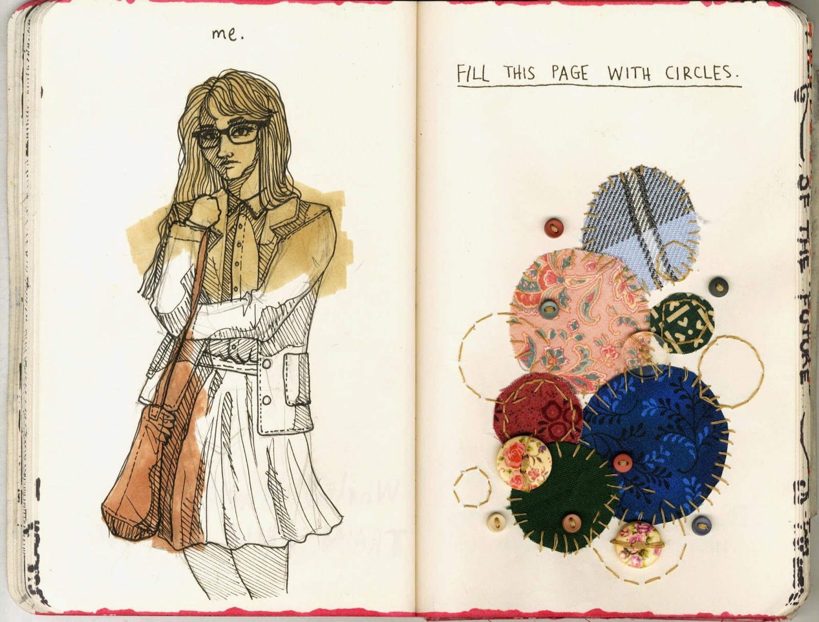
   I decided instead to talk about the Wreck this Journal and how I've been using it as a kind of stress relief. 
  Here are some of the pages I showed in the presentation. 


I talked about how the journal could be personal, emotional and a form of escapism. I also talked about how it made you try different things artistically, and that I found using mediums that I might not usually. It was suggested by one of my tutors that I could think further on how I could incorporate this thought process and the actions and materials of what I'm doing towards my work. I'd honestly never even thought about it that way, I was so used to using it as my 'break' and not even associating it with anything else. I think that's made me open my mind to the possibilities, and maybe this will be able help me change my thought processes a bit. Maybe it will spark off ideas for personal projects. Who knows?! Either way, lots of other students gave really interesting presentations and I left the room feeling motivated, uplifted and inspired; I can't wait to properly get started on potential ideas!