I have enjoyed this last week back though, I hadn't realised how much I missed being in the labs over the summer. Realising that the way of texturing had changed and learning PBR shook me a bit at the beginning of the week, but now that I have done it once I see that it's not too complicated. There are a few things that I need to get used to with it, such as getting the roughness map just right so that it looks better in the engine, but practice will make me more confident with it I'm sure.
This week we were given our first mini group project, which was also used to learn PBR texturing. This was the asset swap project, where we would concept one asset, then swap over and build the next asset from someone else's concept, swap and unwrap the next person's etc etc. This is our scene with our assets in it.
For our first group project, it went quite well I thought. We didn't really communicate well at some points, but towards the end of the project communication grew a lot stronger and we worked together more. I think it would have made things easier if we had set up a Google drive, so the transfer of files would have been a lot easier. I think if we had communicated more throughout, we could have made the assets more highly polished, because not all of them have all of the maps.
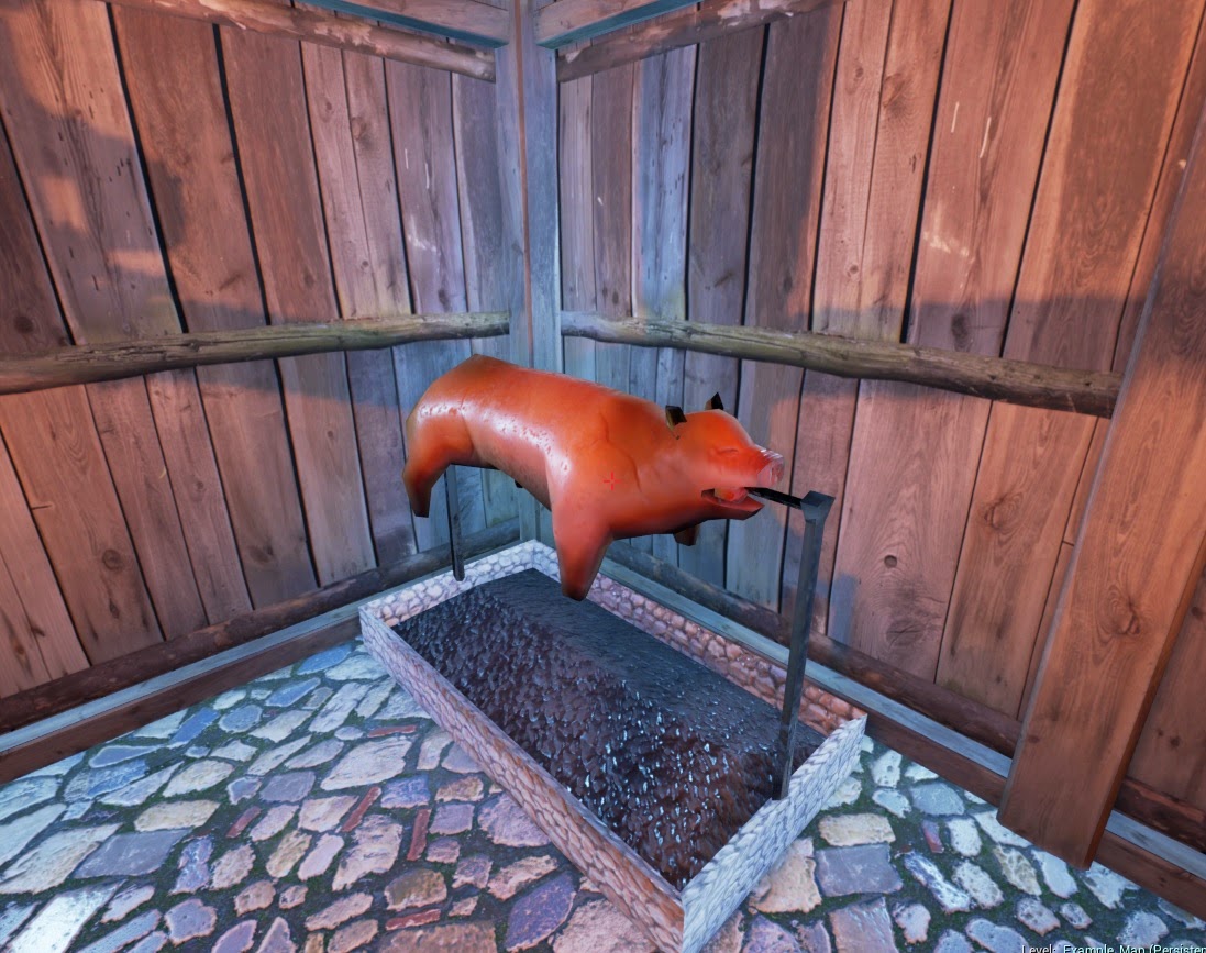
For the asset swap project I ended up unwrapping and texturing the hog roast asset, which admittedly I found a little difficult, because of the skin texture. This was mostly because at the time I wasn't entirely sure how much detail you should include in an Albedo map, but by painting it I could make sure the texture was really flat and included no indication of light.
In UE4, the Hog had a sort of glazed quality and it was hard understanding why it was so shiny when it hadn't been in Marmoset. I was able to fix this somewhat by lightening the roughness maps so it would appear less glossy.
It felt so good to be back in the Life Drawing studio this week too! I love life drawing and I really enjoyed the first lesson back. We first went through the usual warm up techniques to get us started, then did a longer piece focusing on lighting the model and capturing the atmosphere of the model in a sort of scene in our drawings.
I used a brown and black conte pencil for my piece, which I think worked quite well. Using the brown brought slightly more warmth to the figure, so I'd like to use combinations of even lighter browns to improve this.
We started the film scene project this week too, another group project, where we will choose a film scene and re create it in 3D. Earlier in the week, this was a flurry of choosing the coolest scenes from your favourite films and developing on that. After discussing options with tutors in Critical Studies, it became clearer that some of the scenes chosen weren't going to be particularly good to recreate. Chris was saying that after the release of the film Se7en, the grungier, desaturated look was used in increasingly more films and had become fashionable for the current generation. Admittedly, I fall into this category here; I can't help but be drawn to the moody look of a lot of recent films. As a result of this though, a lot of groups had chosen low contrast scenes with a lot of grey/blues and browns etc. Our group had quite a few chosen ones to narrow down from, and two of personal favourites at the time were scenes from Inglourious Basterds and Sweeney Todd.
I liked the bar scene from Inglourious Basterds originally, but I don't think I realised at first that this probably had more to do with the way I felt about this film (as it is actually one of my all time favourite films.) and
this scene, than the appearance of it. I do think it would have been quite fun
to build the scene, but the lighting in it isn't really that interesting, and
the colours are incredibly bland and a little boring.
This
one would have been a good scene to do, despite the very dull, almost grey
colour scheme. The angle of the lighting coming from the large window makes the
scene look quite interesting and I really like the little things like the peeling
wallpaper and missing floorboards. The only problem with this scene that there
wasn't very much at all in the way of assets to build, which would have made it
trickier when sharing out different sections of the project with different
group members.
In the end, this was the scene that we
settled on, from a film called Moonrise Kingdom. This is a very warm coloured scene, unlike majority of the other scenes we had picked, including a lot of
oranges, reds and yellows. The lighting in this scene is quite soft and homely
too, which adds to the warmth of it, and there will be more to build with this
scene too.
I’m enjoying this project so far, and am looking forward to starting
building this on 3ds Max, and also building it in Jack’s lesson, out of
modelling board. I've not had much practice with this type of modelling before
, so I’m looking forward to giving it a go!


No comments:
Post a Comment