Showing posts with label art. Show all posts

Tuesday, 25 March 2014

Inspiration and Art Direction

   As of last week, we first-ies of DMUGA have been presented with a horrifying task. We are to give a presentation, following a sort of 'Pecha Kucha' way of presenting. Working to such specific time lines feels quite daunting, especially when I, at the moment, have no idea what to talk about.
   I suppose I need to think now about what interests me? What, when I look at it, sparks an intrigue in me, making me want to take a second look? What do I look at, with a growing urge to pick up a pencil and draw? The list is too great to even begin, so I suppose the problem isn't being that I can't find anything, perhaps more that I need to be more selective in my choosing.
   At the moment it seems to be one of two things, which can often intertwine. I like things that are maybe a bit unsettling, like Victorian post-mortem photographs, for one example. Well, actually, I hate them. But I am strangely drawn to them at the same time. I have no idea what that is about, it's the same impulse to watch movies that you KNOW will stop you sleeping, but you go ahead and watch anyway, because you secretly love the thrill of the uneasiness you feel. What I mean by this is that images that seem slightly spooky are very interesting to me. Not if it's in an obvious way though.


   This photograph for instance. It's haunting and beautiful and I feel like there's a story somewhere here. I don't know, it may just be a thing personal to me, but I love the unsettling feeling in this, even though there is nothing actually.. wrong here- wait! What's that shadow at the the top of the stairs? A fantastic video to maybe watch is a video by YouTube channel Vsauce. In this video, he explains about a lot of what we find creepy is because of ambiguity. Same as all of Vsauce's videos, this is very interesting, and yeah.. a bit creepy.


   On the other hand, I like history a lot. Yes, in the sense of textbook learning, I am unashamed to admit that history was one of my favourite subjects, and actually one of the things I miss the most about school. Visually though, I mean history more in the sense of decay and abandonment. This in part is actually where my fascination with the Chernobyl Disaster comes from. I love looking at photographs of long ago deserted places, places that are still littered with relics of their past. I don't know, this may be part of that uneasy feeling they cause perhaps? Pinterest is filled with fantastic examples of this.


   I absolutely love images like this because I think they have a fantastic atmosphere. They're so derelict and empty and it truly looks like it was just abandoned over night. I mean, in this case it was, but there's an eerie sense about them that truly gives the indication of a ghost town. 

   It's not just this though. Some of my favourite inspiration comes from artists that I love. Keith Thompson for instance, the subject of my previous post, has been a favourite of mine for a long time. It's a strange thing that only now do I notice I use the same key words when discussing his works. EERIE. STRANGE. UNSETTLING. Maybe I need to broaden my views.
   Other artists I love.. hmm. Well, a lot of my favourite art is from games. I LOVE the art in a game by Arcane Studios called Dishonored. I think the whole game is beautiful too, but the concept art is especially brilliant. I think, actually, that I like pretty much all the design elements of this game. Even down to small elements of the game, like in game posters and portraits, are just so beautiful in their own right. 


   There are more Dishonored works here : http://www.videogamesartwork.com/games/dishonored

   These are some of the character pieces for the game, and what I love about them is that they're a little bit stylized. This caricature kind of style is something that is carried through into the game and I think it makes it more intriguing. 


A good example here with the 'Outsider'. The model even seems to carry across the same painting-like quality that the concept images have.

The poster art is beautiful throughout too. I think I like the posters so much because they remind me of vintage advertisement posters, which in my opinion are way more pleasing to the eye than today's advertisements.


   See what I mean? They have a more illustrative quality that really appeals to me. They're dreary, but written with the same sort of upbeat, urgent kind of advertisement. Now! Do this now! You need this now! Compared to the style of the adverts of now, they're way more visually appealing. Of course, it may be because they have that kind of vintage look of old fashioned posters, which makes sense because for some reason or another, vintage INSTANTLY seems to be quite attractive. Maybe because around the 50s, culture was becoming more adventurous and sex was becoming fashionable. Back to Dishonored though.

Art Direction Task

   How would I write about this game, or even start to present it? I should try and understand WHY it has appeal and to do this, I need to consider composition, shape and form, colour, lighting, mood, personal appeal, etc. 


   This is an environmental piece for Dishonored, showing The Golden Cat, which is a pleasure house in the game. This bit is actually quite grim, as the back rooms, where the girls live, are dingy and dirty. The composition of this piece is quite subtle. It vaguely uses the rule of thirds, which is good because it means that it's not central and symmetrical. If it were, our eye would be drawing straight to the centre, and probably wouldn't stray around too much. This is only really good if you want your audience's eye to be drawn straight to the centre, if that is your obvious subject. The balcony section curves round, which takes our visual field across the whole of the image. A lot of the other shapes in this are curved or circular, the seats being in a cylindrical fashion. The colours are in parts quite rich with reds, golds and greens, but also a little dark and dull. I think that this reflects well the nature of the place, because it's made to look quite grand and luxurious, however a lot of dark deeds go on here. The lamps are the brightest section of the image, so our eyes are drawn to that. They illuminate the plants below, but cast the figures in shadow. The other point of light in the image comes from the woman standing against the wall on the far side, where the light hits her. The mood is calm, but as I said previously, the darkness in the image indicates the dreariness and depravity in which these girls live, and the other dark happenings that take place. It seems to be a way of saying, on the surface, all is good. It appeals to me for these reasons, and I just love the lighting and subtle detail in this piece. It achieves a lot of complexity with less marks and shapes than it would actually first appear.


Sunday, 23 March 2014

Zoot Suits and Spectators - Interesting Character Project

   This is yet another terribly overdue post, I am very sorry about that. However, I loved this project so much, I really wanted to cover it.
   This project was really open in terms of what boundaries we could push. Our only rules were that it had to be realistic. This is to say, it had to be somebody, a person, who would conceivably live on earth. Taking into consideration that this is pretty much your only boundary, you could invent pretty much, well, anyone.

   I started off by going out and drawing interesting people that I saw. In parts this was quite difficult, and I had never realised how difficult it was to pinpoint what makes a person interesting. I think it's not so much how people look, but more how they act. For instance, I ended up watching one man walk hurriedly up and down the street past the window I was looking out. He didn't only pass once, and I think that's why he caught my attention. He was hurriedly walking back and forth, his eyes darting about, looking behind him every so often, covering his mouth. Or maybe he was biting his nails or something? Either way, that right there is a character! If a bit of a nervous, suspicious one.


   I went home for one of the weekends, and decided to try and find more 'interesting' characters. It turned out on that particular day, there were musicians and buskers.. everywhere. There was an amazing group of jazz musicians, with people dancing all around them which was just fantastic.
 
   I was still stuck for an idea for my character though, so I decided to look through my drawings so far, at the key elements that struck out to me. The jazz instruments and massive oversized coats of the musicians reminded me distinctly of the Swing era. This filled me with excitement, as I rushed to my dvd shelf to find one of my favourite films, Swing Kids, and to the internet for research. Swing Kids is an excellent about German youth rebellion in Nazi Germany, with some fantastic music in it. Here is a clip from the movie.


   Also, at this point I'd already kind of mapped out what my idea was. I enjoy creating the back story for my characters, although they're usually not happy ones. I wanted my character to be this nomadic, emotionally exhausted old man, who having lost his family many years previously, (perhaps in the war?) wanders from town to town, donning his threadbare swing clothes and spectator shoes, clutching an old saxophone or something. 

   From here I did a few silhouette studies of some of the dancers in the film and drew up some quick costume studies. I then drew up some concepts of what I thought the character would look like young, so I could progress and turn him into an older man.


   From here, I drew more silhouette type sketches focusing on outfit, and when I'd decided, went on to think about colour etc.


   From here, I was actually happy with my character. I then drew some orthographical views of my character, then a final presented one. If I were to go back to this or re do it though, I would have definitely done another piece, focusing on the character in a specific environment, making him more part of the real world.


Inspiration: Keith Thompson

   I'd like to make a record of some of the artists or resources that inspire me, and I thought I'd start with one of my favourite artists, whom artwork I have loved for a very long time. His work has always been a source of great interest and inspiration to me, because of its illustrative nature. Here is a link to his blog!

   Keith Thompson is a freelance artist, who has worked on films, games, and produced beautiful book illustrations. He drew all of the illustrations for Scott Westerfeld's Leviathan trilogy, one of which I have read. I have yet to read the others, even though I really enjoyed the first.


   These are some illustrations Keith Thompson did for the book 'Drakia'. I think they're fantastic, I absolutely love the atmosphere he achieves in his work. Especially in the bottom image, I love scanning over the picture and seeing what creepy additions can be seen in the scene. That's actually another thing I've always loved about Keith Thompson's work, it is so detailed and I enjoy looking closely at his work to see if there is something I didn't notice the first time. I could seriously just sit and look at his work for ages.


    These are some of my favourite pieces by him, because they have a dark but still quite beautiful nature about them. The Urban Faun, for instance, is eerie and haunting but still soft and gorgeous. I think this feeling is achieved by it being black and white, with the mood being achieved with the tonal qualities. The character is very much the subject of the piece, with the background being subtly hinted at in the background.

   Ooh! Something I didn't know that I only found out the other day, Keith Thompson created the creepy creatures in a film called 'Don't be afraid of the Dark'. I haven't actually seen this, but I've seen an advert for it, I THINK on the trailers on the Chernobyl Diaries DVD. I will have to cover THAT another time because, how interesting I find the Chernobyl disaster is a whole separate issue.


   Anyway, these things are horrible. But I can totally see elements of Keith Thompson's style in there. This illustration for the movie that goes alongside these is so creepy, but beautifully drawn.


 It made me really happy actually to find that a 3D character artist called Alex Stratulat, who has made a model inspired by the above piece by Keith Thompson called 'The Thief'. You can look at his other works here; http://alexstratulat.com/


   This model is very beautifully made and very detailed. Alex Stratulat uses a vast range of tools and programs to create models such as this, like 3D Studio Max, Softimage XSI, Maya, ZBrush, Mudbox, Unfold 3D, V-Ray, Mental Ray, KeyShot, Adobe Photoshop, Adobe After Effect,  Corel Draw, Corel Photopaint. This makes me realise the competition that is out there, and that I must strive for every bit of knowledge I can, and learn all the time, wherever and whenever possible!


Sunday, 17 November 2013

Architectural Brief


   So.. the four weeks we've had for our architectural project have drawn to a close. I finished this a couple of days ago, and although it's not amazing, I am quite pleased with what I have achieved.
 
   My biggest regret about this piece is that I feel I wasn't ambitious enough with my choice of building. I just chose this cute little pub called the King's Head. This thought didn't really occur to me until I was halfway through the mesh. I'm bad enough with stress as it is, and I didn't want to risk going back and finding something else, only to run out of time to do it. I regret this now, however only slightly, because I came across hurdles across the way, which may have prevented me getting it done on time had I gone back to make something larger. I decided that instead, I'd try and add details to make the mesh more interesting, such as lights, satellite dish, etc.
   The UV unwrapping for this mesh caused me much more headaches than it probably should have.. Thing kept going wrong or I'd have to edit parts of the model and reset my UVs. I did end up learning a heck of a lot from this though, so even though it was a pain at the time... I'm glad of it now.
   The tiling textures I actually really enjoyed. Well... I enjoyed the bricks and the roof tiles... I found the grouting incredibly difficult, as you can see by the tiling still on it. Creating all of the textures took a while, but it was worth it seeing it all on the building.
   Once I'd put all the textures on, I decided to make an alpha for the the sections connecting the lamp to the building and I was really pleased with the results. So after that I added a plane and put an alpha on to display the sign on the building.
   At first I found applying normal maps quite difficult. I used a tutorial off blackboard to figure out how to do it, and I followed it to the letter and it still wouldn't work for some reason. I was in the labs at the time and I wasn't the only one struggling with this problem. We were saved though when a helpful second year student showed us what had gone wrong, and it was as simple as changing how the materials are shown in viewport.

   So overall, I am really quite pleased with how this came out. It's simple, but I think the textures and the normal maps made it look a lot better.


Thursday, 7 November 2013

Some of my Work and Thoughts so far...

   So... this post is an ashamedly long overdue post of some of the work I've been doing so far during the course. I've been incredibly lax with the blog, to be honest I've been finding the prospect daunting for some reason. Now is time to right that wrong.
   These are some of my finals from over the weeks of visual design. The first being The Canal Bridge.

 
   I was initially quite pleased with this and I really enjoyed going back to continue this piece. Despite the cold, I felt incredibly serene and peaceful. Whilst I was finishing this piece, I realised I actually liked the view in the opposite direction way better, so I decided I'd give it a go after I'd finished the first.


   I think my second final went much better than the previous. The perspective is nicer, and I feel I made a noticeable improvement from the first to the second in terms of realism and perspective. I also am really pleased with the contrast and amount of depth I achieved. If anything should be improved, I think I need to try harder to draw more realistic looking water, because I feel that the reflections look perhaps a little unrealistic.


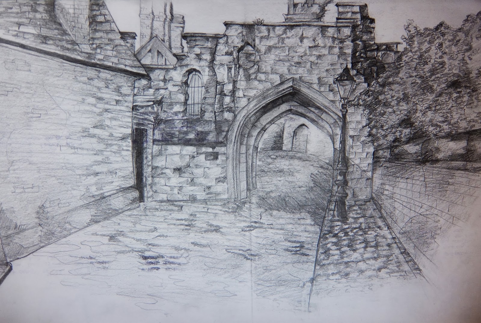
   The second week, we were producing drawings of the archway, which I really loved doing. I liked getting the intricate details in the stones and cobbles, although admittedly I found it tricky to get the correct perspective at first. The drawback of this one was that it was freezing when I revisited to complete the piece, so everything took a lot longer than planned...


   The Student Union. Originally we were working in the Queens building, which was great (mainly because we were out of the rain) but also because the Queens building has some amazing interior structure. It could be perfect for creating an atmospheric, creepy piece of work, but we were learning 2-point perspective, which was quite difficult to achieve in the Queens building. So, the SU! I can't say this was the most enjoyable piece for me, however I found it very useful for developing my skills regarding perspective.


   I found drawing in Bradgate park very enjoyable, even though I didn't get a lot done on my first visit, due to inevitable lousy weather. No matter, the return went much better, with improved weather and the much welcome addition of ice-cream. This piece, I am actually really proud of. I came across this little bridge and instantly felt inspired to sketch it. I'm very proud of the results, because I think I have achieved a nice composition with good contrast. 


   Drawing dinosaur bones in the museum was really fun, aside from the mass unwelcome amount of school children... I think my first final went rather well, and drawing the dinosaur bones has actually been my favourite of monday mornings so far. I found the different intricate sections of the bones really interesting, the shapes inside and the shadows they cast onto the other bones. In my opinion this piece went very well, the pieces delicate, intriguing and strange. 


   Even though I was happy with my first final, I decided I just wanted to do one more. I am so glad I did aswell, because I think it came out brilliantly. Admittedly, I didn't finish it at the museum. I used photo references, sitting up in bed watching Inglourious Basterds and eating everything in sight. So, I think it came out very very well considering it was from photo references.

   On to Life drawing. I. Adore. Life drawing. Art has always been my life pretty much, and I love all of visual design, but there is nothing more useful than drawing the human figure from life, not to me anyway. I'd done it a lot in college and had attended a couple of lessons even before that, so it was so nice to straight away on the first day be drawing the human form. Here's a selection of my favourites from the lessons so far.


   Game Production... My verdict after the first lesson was that I hated it. I couldn't see how I'd ever get my head around it. I was thinking 'If I'm getting stuck now, what am I going to be like a couple of months down the line?!' First lesson, and I was instantly thinking, 'I can't do this' 'I'm never going to be good enough for this course' and I thought I was going to be the only one struggling. 
   Now, I feel much better about it. I'm still not brilliant, and I'm far from the best in my class but I feel like I have improved so much. I feel like I've learnt so much in this short amount of time and I'll admit that I'm proud of myself. I won't give up, I'm going to keep on trying and just try and better myself as much as I can.

   All-in-all? So far, despite getting stressed like hell, I am loving this course.