Showing posts with label game art. Show all posts

Sunday, 16 November 2014

Week 7: Unlucky struggles with Lucky Cat.

    Well, the Sentry Gun project has drawn to a close and to be honest, I could be prouder. Don't get me wrong, I do like the final result, I just wish I could have achieved all that I had wanted to. I'm going to carry on working on it in my spare time if I can though, so I can get a nice piece for my portfolio.
   Following on from last weeks post, from there I went on to texturing, which with PBR is nothing but an absolute joy. Metalness and roughness maps are beautiful things that really make the texture. When it came to texturing I tested it straight in engine, so I would straight away be able to see what the final results would be, instead of putting it into Marmoset and having to edit it again later. The textures on the Daruma doll came out really well, so I feel like it's such a shame that you only see it for about a quarter of a second as it flashes past you.


Below is the main Sentry with just an albedo texture applied to it. The only difficulty I had with this really was with the face makeup, because the seams run up the side of the face.


   As you can see below, once I added the metalness, roughness and normal maps it really brought the model to life. I feel like the cat really looks like shiny porcelain. As well as testing the textures, I made sure that the pivots on the main body of the gun worked the way that they should. I had already been checking it as I went along and noticed as I worked on it that the projectiles weren't firing once I had replaced the example with my own mesh. This was easily solved by placing the socket at the end of the gun barrel and removing the collision mesh.


   By this time it was reaching the last few days of the project. I had made it my stretch goal to get the arm rotating independently, so it could look like it was reloading. I don't think I realised that this would actually be quite difficult, especially as I don't really know anything about blueprints. I received a lot of help from Hazrat to attempt this, and even though we didn't manage to get it working, we sort of got halfway there and I feel like I did learn from it. I say that, but as soon as I try again I will still probably be baffled. *Sigh* It's a learning curve I guess, I'll carry on trying. 


  Anyway, I built the arm separately to be able to do this and it took a lot of editing of the pivots in 3DS Max to get it dead on, because when we tried to get it rotate with the model at certain points it would sort of break away from the body. That works now though, so I'm glad that's one aspect sorted. When we tried to get the arm to rotate back and forth however, it whirled around and disappeared right through the body, turning my Sentry gun into something wildly sassy. I'm going to hand it in without the dramatic arm gestures though, and continue working on it to try and get it working.


   These are my final renders of my 'Maneki Neko' Sentry gun. Like I said, I'm disappointed about the arm rotations and really wish I had pushed it further. Having said that though, I'm pleased with the aesthetics of the final result and am most proud of the overall design process that I went through. It was at this point that I was most inspired and I am so excited to begin concepting for the next project.  

   We were also given the task of creating a poster to show off our design. I thought this was interesting as it's not something we normally do. It was pretty cool to do something different, though I have to say I think I could have come up with something a lot better. I'm going to have to work on my poster design skills too by the looks of things! I do like that this poster is a tad ambiguous. Its message is a bit sinister and I like that, because it was my intent for the sentry gun to be a bit creepy and this adds to that where creepiness is maybe replaced by cuteness.


   Our next project is the 'Dichotomy Character' project, where we have to design a pair of characters that belong to the same universe, but in appearance and personality are completely different. The brilliant thing about this project is that we can adapt whatever style we like. I don't feel like we've really had this opportunity much before, so the prospect of having free reign over the design of our characters feels so exciting!


Tuesday, 15 April 2014

Slowly.. but surely

   Over the past week or so, amongst doing other work, I have been revisiting the Architectural project from Game Production last term. I did this so that I would have more things to incorporate into my UDK scene, but doing it has given me a boost of confidence, because it's given me an opportunity to see how I've improved since then.


   This was my first house, well, pub. At the time, I was so proud of this, but I think honestly I was probably just glad I'd got something done. Looking at it now, it's not AWFUL, but I am not at all proud of it. I have fixed it in parts though, for instance the mortar originally was HORRIBLE on this. It looked like someone had hurled massive globules of porridge at the side of my house (not that I blame them). Not good. I redid this texture, and now it looks a lot better. At least it looks normal anyway.


   This is my new piece, and I am so much happier with it. I still have to make normal maps and some spec maps, but it already looks leaps and bounds better than my other building. It makes me so so happy to see visible evidence that I am improving. Game Production back then was a massive struggle for me, and brought me to tears quite a lot. Sometimes it still does. Not nearly as often though. I actually enjoy it quite a lot now, despite the hiccups I still have here and there. Here's to moving forwards!


Tuesday, 8 April 2014

Reef Character Project

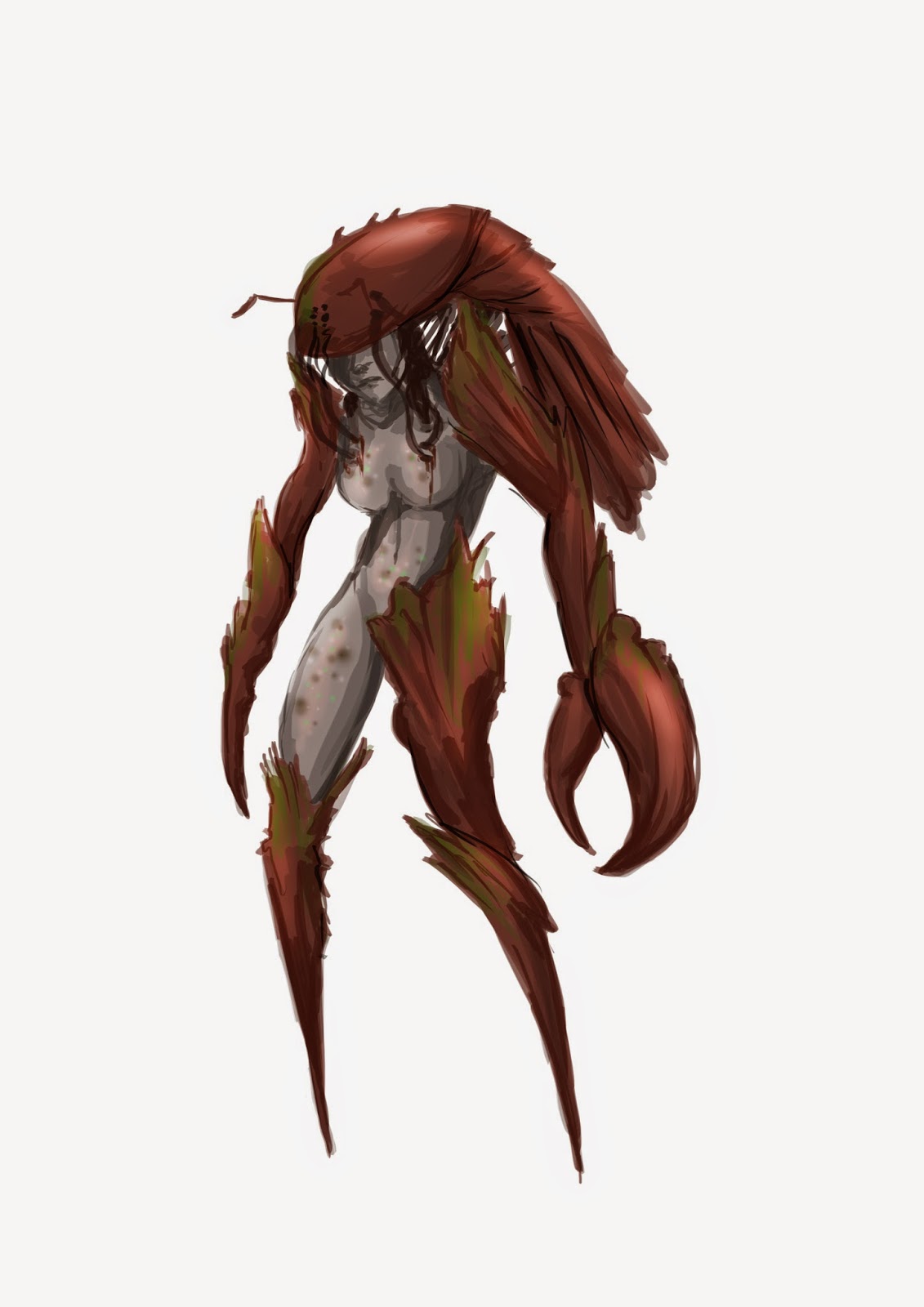
   It was a while ago now, however I recently revisited this project so I'd like to give it a mention. I really enjoyed this project as well, just the same as I have enjoyed the other character design projects so far. I really love the process of going from research stage, exploring possibilities, to finalising the character. I liked this project the best so far, because I felt it was quite versatile and open for all sorts of possible outcomes. Really, our only specifications for this project were to produce a humanoid character based on the 'Reef'. Interpreting this as the barrier reef, I started to search for research material and produced these mood boards.


   I was finding most of my research from Pinterest, which I found an such a valuable source for finding interesting and inspiring pictures. I realised whilst I was gathering my images that I was maybe even too inspired. What I mean by this is that everything I found was inspiring me in some way or another. I had to narrow my searches. I chose a few creatures that interested me the most and created further mood boards. 


   From the mood boards I compiled, I started to produce quick silhouettes of potential characters. At first I found it quite difficult to come up with different ideas and different directions to take them in, but I realised that this was because I was becoming too quickly attached to certain ideas. Oh dear... From the silhouettes I developed my favourite further unto a more established design.


   There are elements I really like about this design, such as the main lobster body being used as a sort of helmet and covering her eyes like a visor. It looks like it could be armour (admittedly sparsely situated armour) but I quite liked the idea of her being an un-willing experiment, an attempt of making a super soldier sub-species. 


   After I had finalised the elements of my character like colour etc, I had to start thinking about setting. I decided that she would have escaped and would be in hiding, somewhere abandoned and derelict. After I had decided this, I created a couple of idea sheets for inspiration. After picking one of my favourites I created a final of her in that situation. I would like to experiment with some of the others at some point though, if I get chance.


   We then had to start modelling our character. I used a material that I used to use a lot when I was younger, called Fimo. Unlike the clay material I used for my last modelling project, it was incredibly easy to mould, so I was able to get a lot more detail into the finished model. After I had finished modelling it, I wanted to paint her. I used acrylics to begin with, but I hated the finish. Using half of my makeup wipes, I removed the paint and was pleasantly surprised to discover that the residue paint left a lovely bone effect on the model. I'd love to say I did this on purpose but nah, it was a happy accident. A technique I'd like to adopt for the future though.


    I felt like I never did a proper final for this project though, not one that I could be really pleased with, so I decided to do another piece to revisit this project. I am much more pleased with this piece, and I feel like I really understand the colours and anatomy of my character. 


Tuesday, 25 March 2014

Inspiration and Art Direction

   As of last week, we first-ies of DMUGA have been presented with a horrifying task. We are to give a presentation, following a sort of 'Pecha Kucha' way of presenting. Working to such specific time lines feels quite daunting, especially when I, at the moment, have no idea what to talk about.
   I suppose I need to think now about what interests me? What, when I look at it, sparks an intrigue in me, making me want to take a second look? What do I look at, with a growing urge to pick up a pencil and draw? The list is too great to even begin, so I suppose the problem isn't being that I can't find anything, perhaps more that I need to be more selective in my choosing.
   At the moment it seems to be one of two things, which can often intertwine. I like things that are maybe a bit unsettling, like Victorian post-mortem photographs, for one example. Well, actually, I hate them. But I am strangely drawn to them at the same time. I have no idea what that is about, it's the same impulse to watch movies that you KNOW will stop you sleeping, but you go ahead and watch anyway, because you secretly love the thrill of the uneasiness you feel. What I mean by this is that images that seem slightly spooky are very interesting to me. Not if it's in an obvious way though.


   This photograph for instance. It's haunting and beautiful and I feel like there's a story somewhere here. I don't know, it may just be a thing personal to me, but I love the unsettling feeling in this, even though there is nothing actually.. wrong here- wait! What's that shadow at the the top of the stairs? A fantastic video to maybe watch is a video by YouTube channel Vsauce. In this video, he explains about a lot of what we find creepy is because of ambiguity. Same as all of Vsauce's videos, this is very interesting, and yeah.. a bit creepy.


   On the other hand, I like history a lot. Yes, in the sense of textbook learning, I am unashamed to admit that history was one of my favourite subjects, and actually one of the things I miss the most about school. Visually though, I mean history more in the sense of decay and abandonment. This in part is actually where my fascination with the Chernobyl Disaster comes from. I love looking at photographs of long ago deserted places, places that are still littered with relics of their past. I don't know, this may be part of that uneasy feeling they cause perhaps? Pinterest is filled with fantastic examples of this.


   I absolutely love images like this because I think they have a fantastic atmosphere. They're so derelict and empty and it truly looks like it was just abandoned over night. I mean, in this case it was, but there's an eerie sense about them that truly gives the indication of a ghost town. 

   It's not just this though. Some of my favourite inspiration comes from artists that I love. Keith Thompson for instance, the subject of my previous post, has been a favourite of mine for a long time. It's a strange thing that only now do I notice I use the same key words when discussing his works. EERIE. STRANGE. UNSETTLING. Maybe I need to broaden my views.
   Other artists I love.. hmm. Well, a lot of my favourite art is from games. I LOVE the art in a game by Arcane Studios called Dishonored. I think the whole game is beautiful too, but the concept art is especially brilliant. I think, actually, that I like pretty much all the design elements of this game. Even down to small elements of the game, like in game posters and portraits, are just so beautiful in their own right. 


   There are more Dishonored works here : http://www.videogamesartwork.com/games/dishonored

   These are some of the character pieces for the game, and what I love about them is that they're a little bit stylized. This caricature kind of style is something that is carried through into the game and I think it makes it more intriguing. 


A good example here with the 'Outsider'. The model even seems to carry across the same painting-like quality that the concept images have.

The poster art is beautiful throughout too. I think I like the posters so much because they remind me of vintage advertisement posters, which in my opinion are way more pleasing to the eye than today's advertisements.


   See what I mean? They have a more illustrative quality that really appeals to me. They're dreary, but written with the same sort of upbeat, urgent kind of advertisement. Now! Do this now! You need this now! Compared to the style of the adverts of now, they're way more visually appealing. Of course, it may be because they have that kind of vintage look of old fashioned posters, which makes sense because for some reason or another, vintage INSTANTLY seems to be quite attractive. Maybe because around the 50s, culture was becoming more adventurous and sex was becoming fashionable. Back to Dishonored though.

Art Direction Task

   How would I write about this game, or even start to present it? I should try and understand WHY it has appeal and to do this, I need to consider composition, shape and form, colour, lighting, mood, personal appeal, etc. 


   This is an environmental piece for Dishonored, showing The Golden Cat, which is a pleasure house in the game. This bit is actually quite grim, as the back rooms, where the girls live, are dingy and dirty. The composition of this piece is quite subtle. It vaguely uses the rule of thirds, which is good because it means that it's not central and symmetrical. If it were, our eye would be drawing straight to the centre, and probably wouldn't stray around too much. This is only really good if you want your audience's eye to be drawn straight to the centre, if that is your obvious subject. The balcony section curves round, which takes our visual field across the whole of the image. A lot of the other shapes in this are curved or circular, the seats being in a cylindrical fashion. The colours are in parts quite rich with reds, golds and greens, but also a little dark and dull. I think that this reflects well the nature of the place, because it's made to look quite grand and luxurious, however a lot of dark deeds go on here. The lamps are the brightest section of the image, so our eyes are drawn to that. They illuminate the plants below, but cast the figures in shadow. The other point of light in the image comes from the woman standing against the wall on the far side, where the light hits her. The mood is calm, but as I said previously, the darkness in the image indicates the dreariness and depravity in which these girls live, and the other dark happenings that take place. It seems to be a way of saying, on the surface, all is good. It appeals to me for these reasons, and I just love the lighting and subtle detail in this piece. It achieves a lot of complexity with less marks and shapes than it would actually first appear.